


Bear Traps and Log Charts
Well, I must remember not to go away again – bad things happen! The last 2 weeks have not been particularly enjoyable – marketwise, I mean (I had a nice holiday!) So what’s happening? Are we in a bear trap?
🎧 Listen: ITM Blog 45 – Bear Traps and Log Charts

As with anything in the stock market we will only know for sure after it has happened – and for this to be a bear trap SPY will have to eclipse its previous high of $687 on 29 October. It is now trading at $671 so it has to have a 2.5% increase to get there.
Let’s review bear and bull traps: when markets are going up (bull markets) or going down (bear markets) there are traps along the way.
- Bear markets pause on the way down and have a rally, then carry on going down. This is a bull trap (it catches the bulls.)
- Bull markets pause on the way up and have a sell-off, then carry on going up. This is a bear trap (it catches the bears.)
Bull Traps and Bear Traps
Bull traps and bear traps are mirror images. They can mean:
- The trend is reversing (the tide is changing) OR
- It’s just a hiccup (it was just a freak wave)
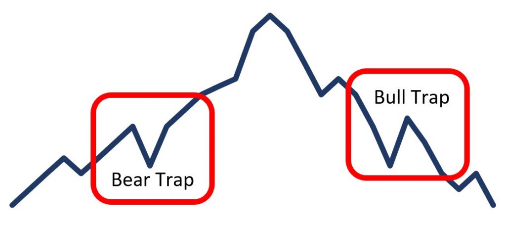
If you think it means the trend is reversing (the tide is changing) and sell your positions but keeps going up (it was just a freak wave) you have been caught in a bear trap. Conversely, if you are in a bear market and there is a temporary increase in prices, and you buy thinking that the worst is over, then you have been caught in a bull trap.
Are we in a Bear Trap?
As yet too early to tell, but I think so. A drop below $640 would suggest that it could be the tide turning, but we are a way off it yet. It needs a drop to 620 to be a fully-fledged correction, but lets hope that is not what is happening now.
But what about a Bubble??
We are all used to seeing scary articles about how we are in a bubble – but are we really. Usually, the article is accompanied by a graph like this:
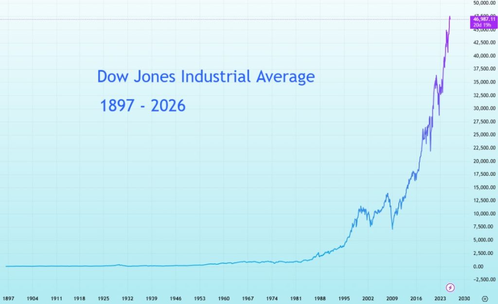
Which looks quite frightening, of course. How can things continue to go up? It’s already stratospheric! What’s really happening is all in the linear scale on the right axis which makes it look as though the Dow did absolutely nothing for the first hundred years then suddenly zoomed up. Now look at this graph:
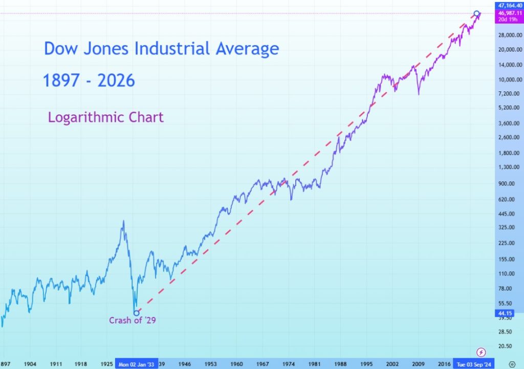
It shows quite a different story, doesn’t it? I’ve marked the crash of 1929 and you can see what a massive movement it was, even though it barely registers on the first chart.
I’ve drawn in a trend line for the last 100 years (red dashes). Unlike the first chart, the Dow appears to be climbing in quite an orderly manner.
Log Scale (logarithmic)
Why use a log scale? Because it evens the playing field. Instead of treating every point on the Y-axis as an equal number of dollars, it treats them as equal percentages. That means a move from 100 to 200 shows the same rise as 1,000 to 2,000 – both are 100% gains.
On a normal (linear) chart, the early decades of the Dow look flat and irrelevant because the index was so much smaller back then, but on a log chart, you can finally see those big swings for what they were – massive moves in their day. It’s the only way to get a true picture of long-term growth and the way markets really move: by percentages, not by points.
What About SPY?
Because we are usually concentrating on the last few months or years, we tend not to use log charts, but it is a good idea to step back from time to time. Here is SPY since it started in 1993 on a standard (linear) chart:
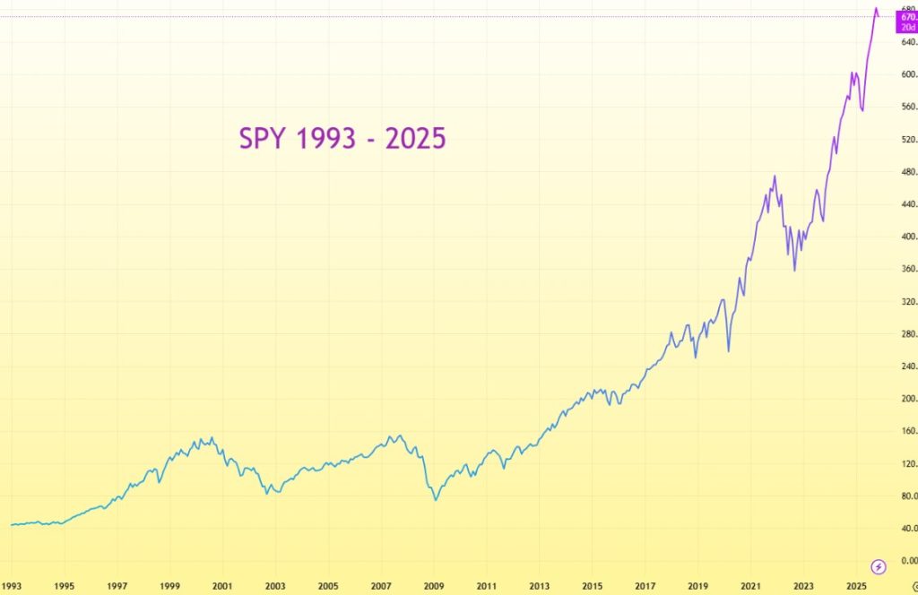
Like the Dow, this looks pretty scary – a ‘hockey stick’ graph that screams ‘bubble!’ But let’s put it on a log chart and see the real story:
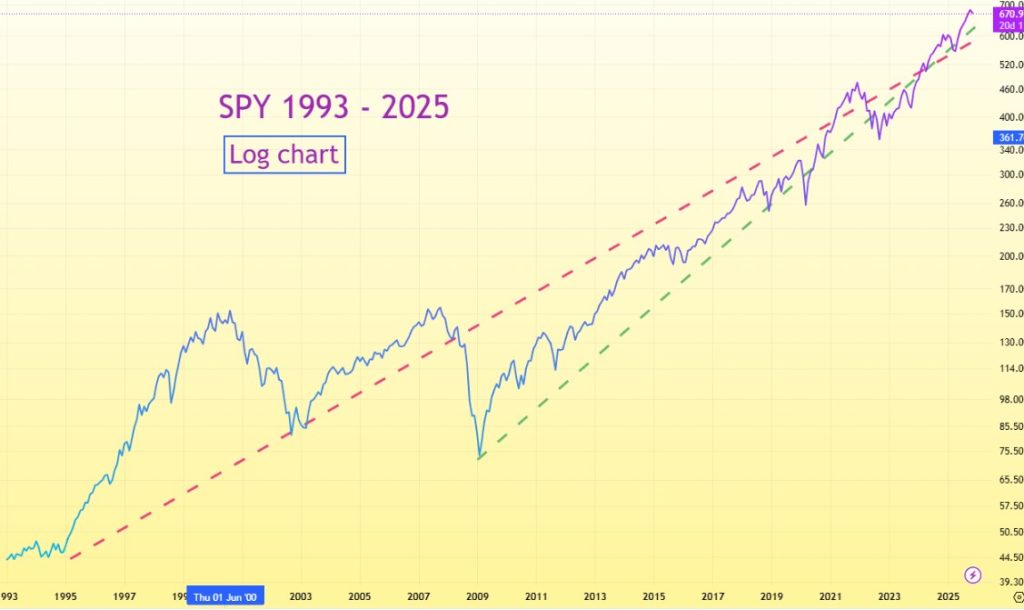
Doesn’t exactly look like a bubble, does it? I’ve drawn in two trend lines, one starting in 1993 (red) and the other in 2008 after the GFC (green). Both fit SPY rather well – though of course, trend lines are not objective as it depends on your choice of starting dates.
How to do LOG charts
The charts on this website do it easily – simply hover over the RH axis until you see the drop down menu, then choose ‘log’. Hours of fun! Here’s the link: HeatherCullen.com / charts
To the markets . .
The market has had a bit of a pullback over the last two weeks – to be expected, really, with the government shutdown still unresolved. Is it serious? (the pull back, not the shutdown). Let’s check the charts.
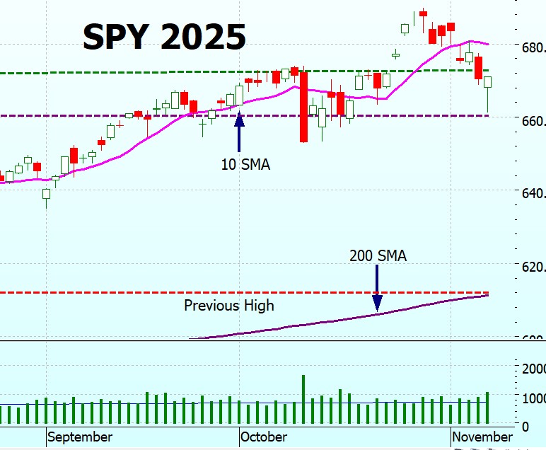
SPY Charts
SPY is still trading on above average volume, so traders aren’t being scared away. Friday saw a ‘spring’ candlestick which often signals the bottom of a downturn, on relatively high volume. As always, we’ll only know that afterwards, but the signs look encouraging. I would be happier if the tail had touched a recognised level. I have drawn in the line (purple dashes) but it doesn’t seem to be particularly significant, other than being a nice round number ($660).
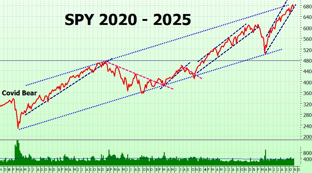
The long-term chart shows SPY sitting at the lower bound of its 2025 trading channel, but still close to the upper bound of the post-Covid channel. (And remember — this isn’t a log scale!)
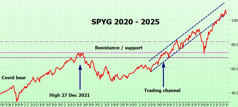
SPYG Charts
SPYG is following the same pattern as SPY.
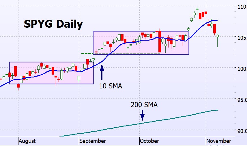
On the long term chart SPYG is still sitting on the lower bound of the trading channel.
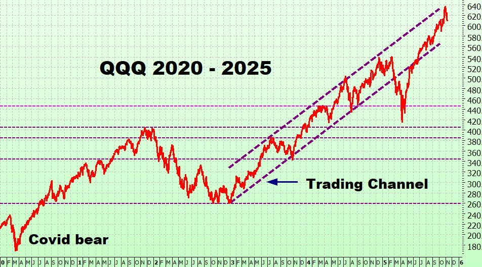
QQQ Charts
QQQ is also following the SPY pattern, but with a more clearly defined spring (candlestick).
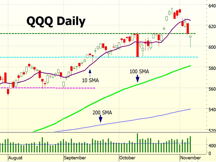
On the long term chart QQQ is back in the middle of the trading channel after neatly bouncing off the upper bound. As always, I am amazed at how accurately the charts predict – most of the time!
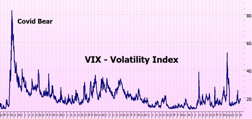
VIX Chart (Volatility)
Still in low volatility territory (<20)
NVDA (NVIDIA)
NVDA doesn’t report until the 19 November (it always seems to be the last to report) but I thought we’d take a look at how it is travelling.
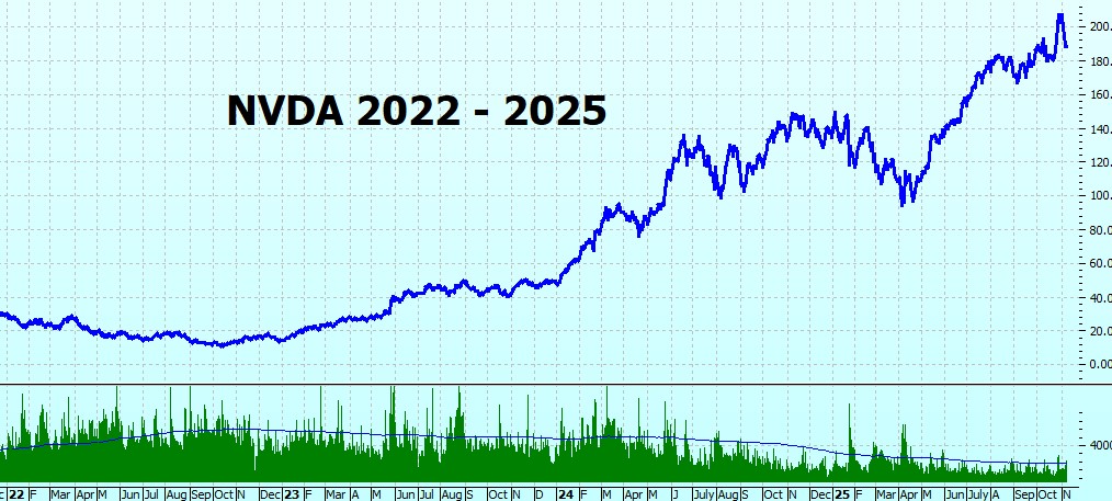
NVIDIA’s volume drop isn’t a warning sign – it’s just what happens when a stock becomes a giant. Most of its shares are now held by big institutions that buy and hold, so they don’t trade in and out every day. A lot of the action has also shifted into options, where traders can get exposure without moving the stock itself. Add in the fact that NVDA is now sitting inside just about every ETF and index fund, and those passive holdings don’t turn over much either. In short, it’s not that people lost interest – it’s that most of them already own it.
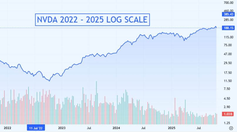
NVDA looks quite different on a log chart:
NVIDIA at $4.75 trillion is the highest market-cap company in the U.S. It is followed by AAPL at $4.00 trillion and MSFT at $3.72. Tech companies rule! NVIDIA’s rivals are AMD ($416 billion) and INTC ($183 billion), both considerably smaller. Overall, the highest caps are:
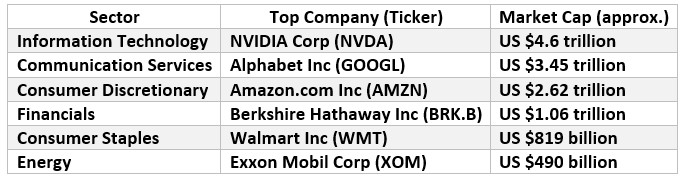
The ‘Magnificent Seven’ still dominate.
The week ahead
With the government still in shutdown mode, the usual economic numbers — like October’s CPI and PPI — are on hold. That means the spotlight’s on corporate earnings and whatever the Fed decides to say, rather than on any fresh macro data. Results from Walt Disney Company, Cisco Systems, Applied Materials and CoreWeave Inc due this week.
The Futures
The futures are in party mode – I assume because they can see the end of the shutdown? Let’s hope so; it has gone on long enough.
There and back again . .
Sorry if my absence last week caused any hassle – I did mention it, but it was right at the end of the blog so people missed it.
But I am back now, and here’s the beach this morning:
All to myself. Beautiful!

Fingers crossed for a good week!
Heather
Trade the tide not the waves
Q & A
Related Posts
- Bear Trap?
Is It A Bear Trap? Maybe. Maybe not. As with all things in the stock…
- Trading The Bear!
In The Money: Bear Trading Strategy The new book in the In The Money series…
- This Bear will NOT behave!
ITM Special Update 11 Jan 2023 This Bear will just NOT behave! Well, last night…


15 Responses
Dear Heather and ITM Readers,
This week, Warren Buffett issues his Thanksgiving letter to Berkshire Hathaway shareholders concluding his 60 years of services to Berkshire Hathaway. Likewise, thank you, Heather, for your 25 years of investing and trading experiences. Cheers to the next 25 years to Heather and the ITM Readers. Thank you so much for your wonderful weekly blogs.
Thank you, Geaorge Henry! You always cheer me up!
x
h
You said “I would be happier if the tail had touched a recognised level.” It actually did. It bounced right off the 50 day ma. Both SPY and QQQ. Beautiful.
Hey Jamie – well done, I didn’t notice that!
Thank you!
h
Hi Heather,
I’ve been wanting to ask this question for quite sometime. Looking in terms of percentages, SPYG seems to have grown far ahead of SPY. Is there a reason why we need to stick with SPY for ITM instead of SPYG?
Thanks,
HI Danny,
Good question, and one that comes up quite often!
You’re right, SPYG has outpaced SPY in some periods, especially when growth stocks are leading. But ITM is designed to follow the market as a whole, not just one sector. SPYG is much more concentrated — a handful of stocks make up a large part of it — which means it can run faster on the way up but fall harder when leadership shifts. It’s also less traded than SPY, so the bid–ask spreads are wider, which can eat into returns.
SPY gives broader exposure, cleaner signals, and tighter spreads — exactly what you want for a long-term, rule-based strategy like ITM. SPYG is meant as a stepping stone into trading SPYG and to use any spare cash until you have enough for an additional SPY option.
Hope this helps,
h
Thank you Heather, that helps and yes, it makes sense now. Thanks again!!!
Thank you, Heather and ITM Readers. The stock market came back strongly on Monday and there is a Veteran’s Holiday on Tuesday. Good luck to all.
Hey George Hentry – yes Mondya was rather good, wasn’t it!
I know tomorrow is a holiday – but it is only the bond market that is closed – the NYSE is open as usual?
x
h
Thank you. Glad to have you back, the beach looks awesome.
How is the new book doing?
Hi Kate (I got that right?)
The beach is beautiful, I m so lucky to live right there! I am moving to a new place early nect year, but close by so this will still be my beach. I get quite annoyed when other people are there!
The new book – almost on schedule, redoing all the backtesting on the bear right now, still hoping for a publishing date of January – well, that’s what I am aiming for!
x
h
Heather.i appreciate your words, as always.
Just to be sure Im on the same page, it is the 6 month chart you use to watch the 10 and 200 SMAs isnt it?
Also, I wondered how you like the IWM for smaller accounts that are maybe not quite up to the SPY long calls.
The small cap index ETF tracks the SPY closely and has more affordable ITM calls. Just curious.
Thanks again. Hope your day is delightful.
Hi David – I use a daily chart (i.e. one candlestick = 1 day).
To get this on the charts on this website sompley chpose 1 day from the frop down on the top LH of the chart – don’t use the bottom settings.
This way by using your mouse wheel you can zoom in and out – always on a daily chart.
Hope this helps.
h
Wonderful analysis – as usual. Thanks Heather!
Tha k you Blake – glad it was useful.
h