I was listening to a friend complaining that his shares never seemed to do anything. He was expecting sympathy, but didn’t get it.
I stopped feeling sorry for Australian investors years ago.
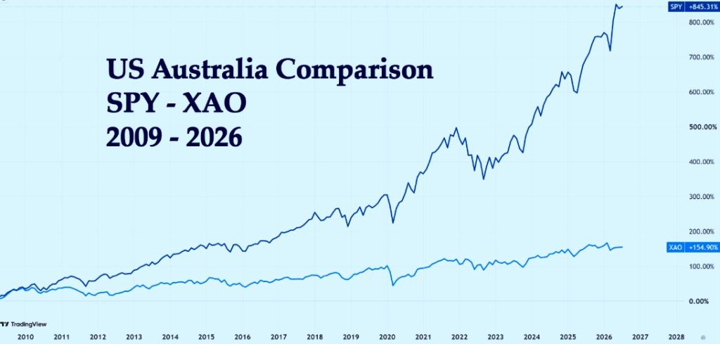
Why? Rather than explain – yet again – I simply showed him this chart:
There wasn’t much that needed to be said. Since the GFC, here’s what happened:
Australia : + 155%
US: + 845%.
More than 5 times as much! Is it any wonder I didn’t have much sympathy?
Home Bias
Most Australians suffer from home bias. The irony is that, among the world’s major stock markets, they’ve chosen one of the worst places to invest. Which naturally got me wondering:
Was I suffering from a similar problem?
An away-from-home bias?
Perhaps I had convinced myself the US was best simply because that’s where I traded. There was only one way to find out. I decided to compare the world’s major markets to answer the question:
Is there a better country than the US to invest in?
Which country is best?
But first I had to decide on the time period. Maybe post GFC wasn’t the best starting point? I decided to go back to the start of the century (it seemed like a nice, defensible choice). And what would I measure? The biggest, most representative index in each country.
Australia?
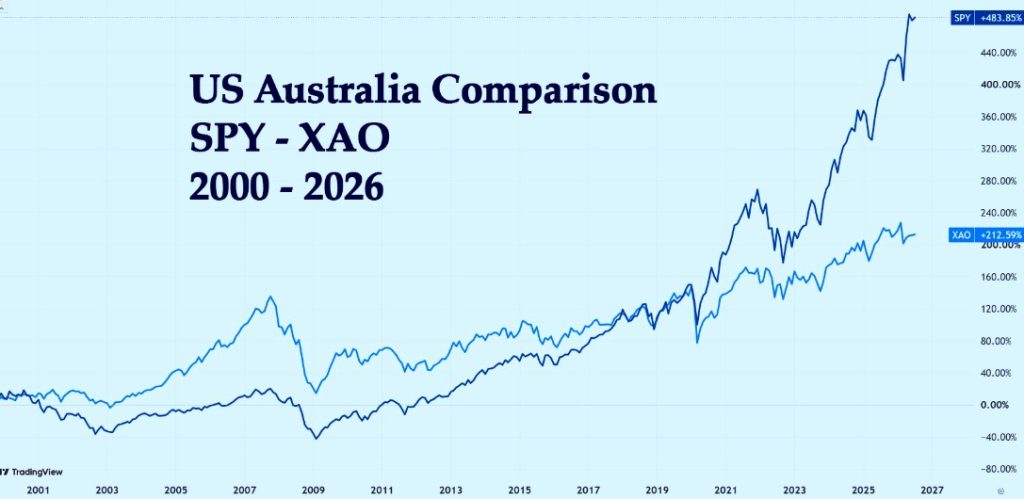
So first I returned to Australia to see how we had compared in the last 26 (almost) years.
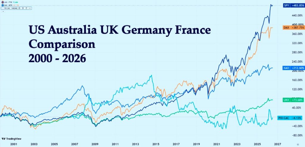
Australia held up better during the tech-wreck, probably because relatively few technology companies were listed, which lifted the overall performance to:
SPY: +484%
XAO: +213%
The U.S. has returned more than double the Australian market. And check out the recovery from the GFC – Aus didn’t regain the peak from before the GFC until 12 years later!
What about the U.K.?
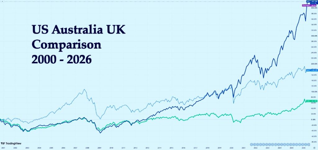
The FTSE 100 is the main index – lets add it to the chart (the green line)
Hmmm . . . makes the Australian market look positively bouncy! The figures:
SPY: +484%
XAO: +213%
FTSE: +74%
Wow – that surprised me. I knew it was going to be bad, but that is far worse than I expected. Look at the FTSE from 2000 to 2021 – twenty-one years with virtually no capital growth. During that same period, UK prices rose by about 76%.
In other words, although the index ended roughly where it started, its purchasing power had fallen dramatically. That’s a sobering result for anyone relying on a simple buy-and-hold strategy.
And It definitely shoots a rather large hole in the ‘it’s time in the market’ argument. But let’s check out some more countries:
How did Germany do?
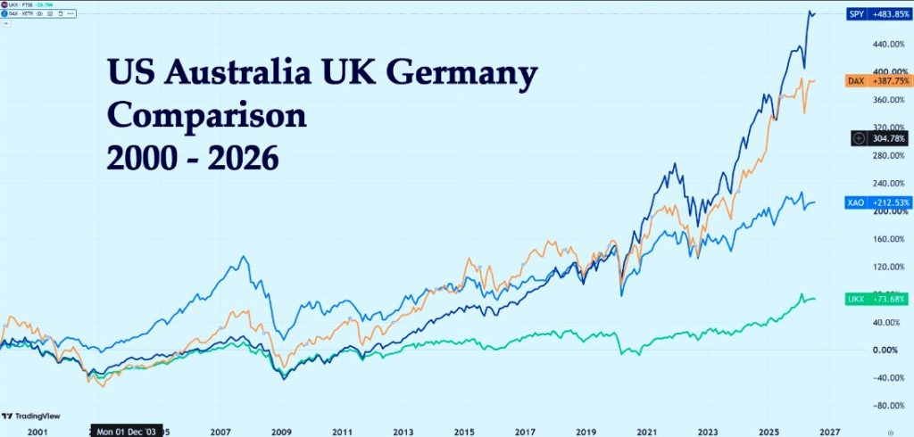
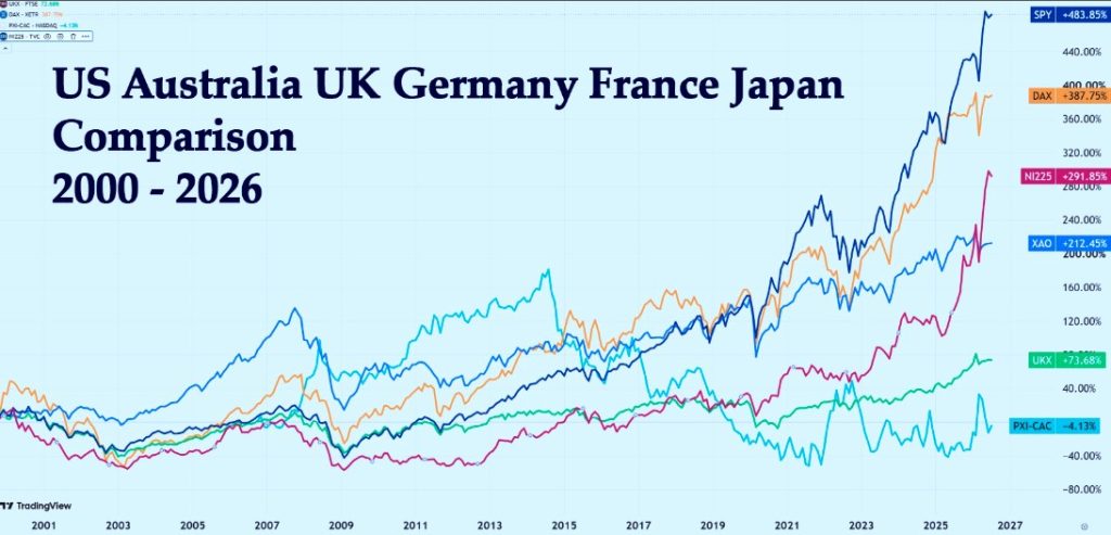
The German DAX was a much better performer: 388% (the yellow line). The large losses in 2003 would still have been painful, but the long-term recovery was impressive.
At last – a market that gives the U.S. a decent run for its money. Not enough to win, but enough to prove this isn’t simply an American fairy tale.
France?
What about la belle France? (CAC – Turquoise line) The French? Ils ne sont pas très heureux. You wouldn’t be smiling either if you’d held for twenty-six years and your investment was worth less than when you started.
Apart from Germany, Europe seems like a bit of a basket case. So, let’s travel round the world to the orient.
Japan?
The Nikkei 225 was a bit of a late bloomer (the red line). Japan spent almost twenty years going nowhere before finally springing to life in the last few years, reaching almost 300% and coming in third after U.S. and Germany.
So which country is best for investors?
I think the charts tell the story! The lesson isn’t that every American share is better than every Australian, British or French one. The lesson is:
The market you choose matters.
A great company swimming with the tide has a tailwind. The same company swimming against it has to work much harder just to stand still.
Were we right?
Our choice of the US market seems like the right one. Of course: Indexes are not the full story. It’s the effect on your account that matters. But that’s another blog.
n.b. all the percentages are read off the chart so are not completely accurate – but accurate enough to tell the story.
To the markets . . . .
A bit of a nothing week – not bad but not particularly good.
SPY Charts
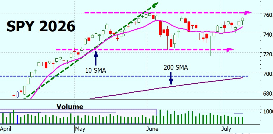
Still in a consolidation phase, bouncing between 725 and 760. The volume is dropping off, but that’s what we expect in a consolidation phase. We are nearing the upper bound and breaking through that would be a bullish sign.
Will it? We don’t know. Consolidation periods can last for months, but the longer they last the more definite the trend when they break out. Usually.
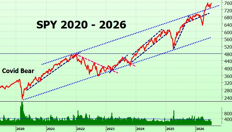
Longer term tells a slightly different story – it has bounced off the upper bound rather than going meekly back into its trading channel. Is this a bullish sign? Technically, yes. Practically, it is possible but by no means for sure.
SPYG Charts
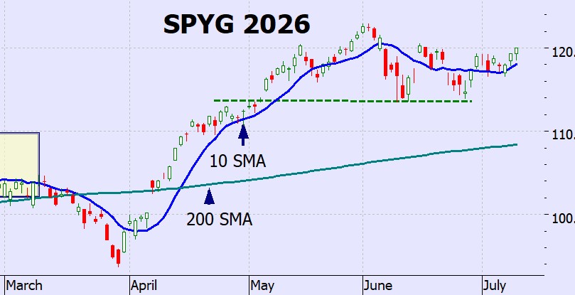
Also in a sideways consolidation pattern. Heading up – but whether it will make new highs or continue sideways remains to be seen.
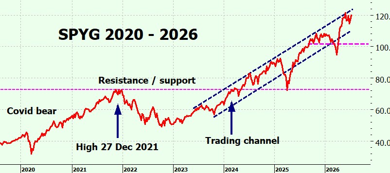
Longer term it is still in the trading channel, and hesitating at the $120 level.
QQQ Charts
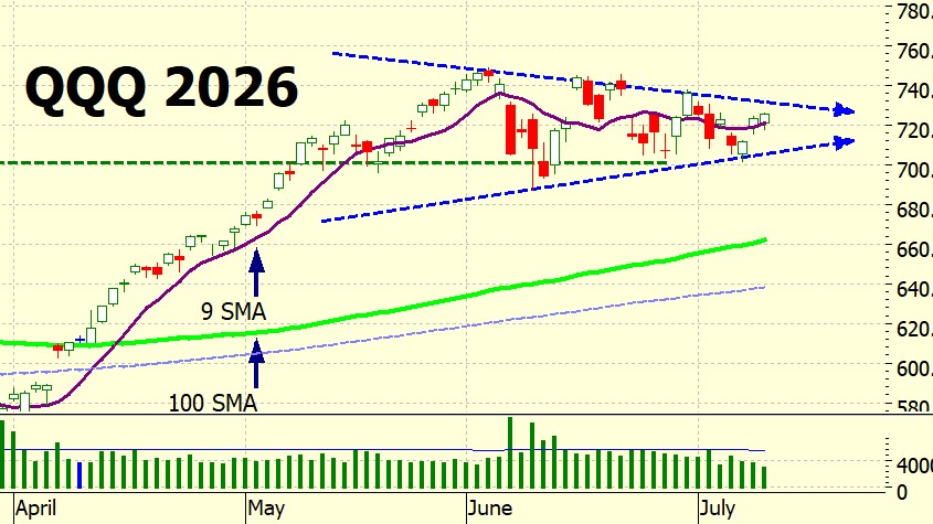
Also consolidation (this is getting monotonous!) but the swings are getting smaller, making a triangle pattern – which it must eventually break out of. Probably this week.
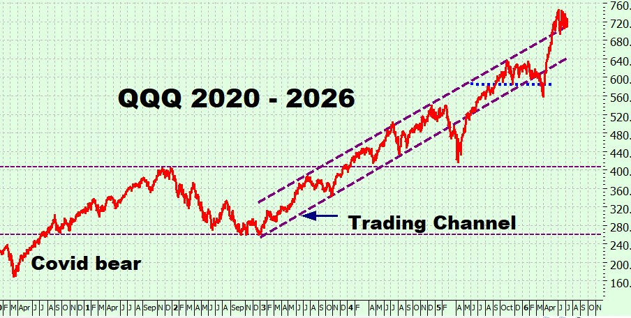
Longer term you can see how bunched up it is at the top bound of the trading channel. Let’s hope it doesn’t feel moved to get back inside it!
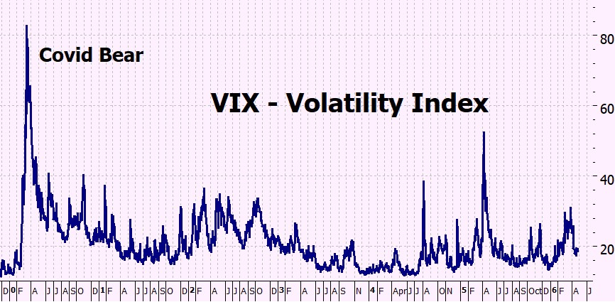
VIX Chart (Volatility)
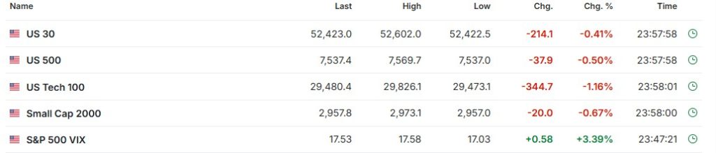
Low volatility – to be expected when in a consolidation Phase.
ITMeter
The week ahead . . .
This week’s spotlight is inflation and the Federal Reserve. June CPI and PPI will provide fresh evidence on inflation, while Fed Chair Kevin Warsh makes his first semiannual testimony to Congress. Second-quarter earnings season also gets underway with reports from the major banks, followed later in the week by ASML, TSMC and Netflix.
Monday
Reports: Monthly Federal Budget
Earnings: None of note
Tuesday
Reports: CPI (Inflation), NFIB Small Business Optimism, Fed Chair Warsh testifies to Congress
Reports: PPI (Producer Inflation), Federal Reserve Beige Book
Earnings: Bank of America, Goldman Sachs, Morgan Stanley, Johnson & Johnson, ASML
Thursday
Reports: Retail Sales, Weekly Jobless Claims, Philadelphia Fed Manufacturing Index
Earnings: Taiwan Semiconductor (TSMC), Netflix, Abbott Laboratories, GE Aerospace
Friday
Reports: Housing Starts, Consumer Sentiment, Industrial Production
Earnings: American Express, Charles Schwab, 3M
The futures
Are looking very dismal – presumably it’s the Middle East situation.
But don’t be too despondent – we’ve noted that they bounce around a lot recently.
I sacked AI . . .
I was using AI to generate the podcasts (which were quite good) and the videos (which were not very good at all) – from my source material, of course. I have been increasingly unhappy with the videos so I decided to try something different – making my own, narrating it myself.
Have a look at this week’s video – feedback welcome below, just be kind!
Heather
Trade the tide not the waves
Q & A
2 Responses
As always, you have such interesting, provocative, and worthwhile information to bestow upon your readers. Are people listening?…..I sure hope so, because the facts speak for themselves. But of course….the future….what will happen? Who knows, but I wouldn’t bet against the US stock market in favor of another country quite yet!
And your podcast….wonderful….You have a very pleasant voice and the charts are great !!
Many thanks for your all that you provide to us,
JT
Thank you Jeff!
Since I posted it I’ve had lots of second thoughts – it was a last minute decision – I only decided to try it this morning so it was a bit of a rush and there wasn’t time to proof it.
So its nice to know i haven’t made a complete idiot of myself!
x
h


































2 Responses
As always, you have such interesting, provocative, and worthwhile information to bestow upon your readers. Are people listening?…..I sure hope so, because the facts speak for themselves. But of course….the future….what will happen? Who knows, but I wouldn’t bet against the US stock market in favor of another country quite yet!
And your podcast….wonderful….You have a very pleasant voice and the charts are great !!
Many thanks for your all that you provide to us,
JT
Thank you Jeff!
Since I posted it I’ve had lots of second thoughts – it was a last minute decision – I only decided to try it this morning so it was a bit of a rush and there wasn’t time to proof it.
So its nice to know i haven’t made a complete idiot of myself!
x
h